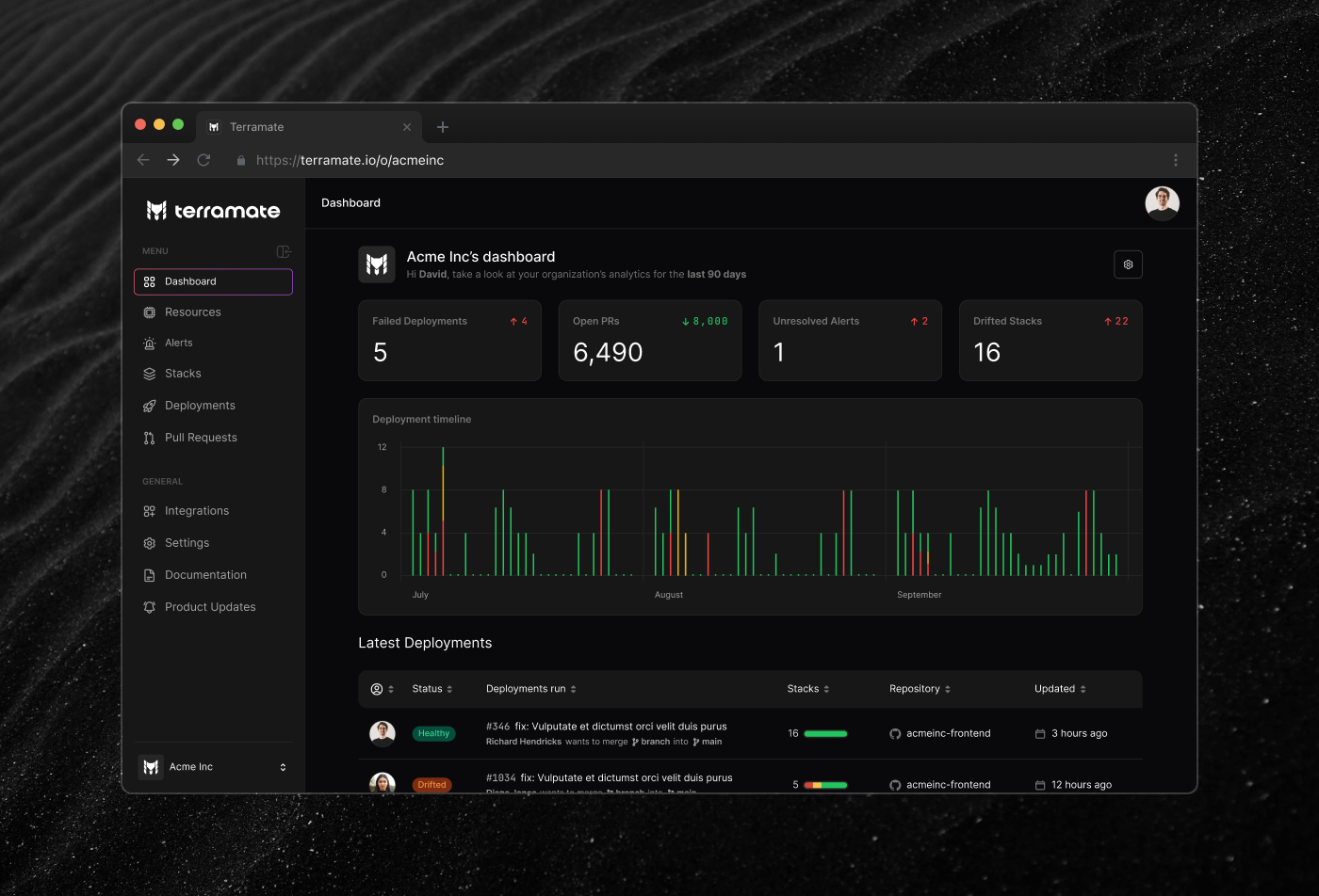
Terramate helps engineering teams manage infrastructure across Terraform and OpenTofu projects. It splits state into smaller units called stacks, which makes large deployments faster and easier to work with. On top of that it adds orchestration, CI/CD integration, drift detection, and visibility into what's running and what's changed.
It started as a CLI-only product. Terramate Cloud came later, as a visual layer on top of what engineers were already running. The web side gives you the overview, the CLI handles the day-to-day.
Most Terraform users are DevOps engineers and work from the terminal. Introducing a web platform to that workflow raises an obvious question: what do you actually gain?
That was the real design problem. Not making the UI usable, but making it feel worth switching to. This audience didn't need things simplified, they needed to see what's happening, and anything that hid information instead of organizing it would work against the product.
Another challenge was that priorities were shifting constantly. That's normal at a startup but it still requires discipline to keep the design work moving forward.
I joined in 2023 as Head of Design. Most of the work was on the product: dashboards, deployment views, drift detection, onboarding, alerting, the design system in Figma. I also worked outside the product on the website, visual identity, social content, and events. Getting to touch multiple fields is one of the reasons I've always liked working at early-stage companies. Staying close to how the product was being talked about externally kept the design work grounded.
One of the things I'm most proud of is being able to step into the frontend team for the first time. As my knowledge of the platform grew, I was able to fix multiple visual bugs and even implement small features.
There were a few aspects and considerations we took into account while working on the product:
Terraform engineers scan terminal output fast. They're used to dense, structured information and they know what they're looking for. That shaped how we approached layout and hierarchy throughout the platform. A UI full of lists was fine for this audience, but we still needed a single place that pulled everything together at a glance.

We tried not to over-simplify. A lot of IaC tooling hides complexity behind a friendly interface. Terramate's approach was different: show the data, and do it clearly.

Some pages had very dense tables. We managed the information load through filters, column toggling, and merging related rows.

Onboarding was its own problem. Running terraform apply is
already a complete workflow, and that's exactly where new users would drop off.
We built a step-by-step flow to make sure people saw the value of the platform
early, before the CLI felt like enough on its own.

The hardest version to design was mobile. A lot of users came in through Slack or email links to quickly check the state of a stack or deployment. We stripped back the information significantly, keeping only what someone actually needs when they're not at their desk.

Supporting both themes meant maintaining two palettes across the whole design system. As the sole designer, that added up quickly.

